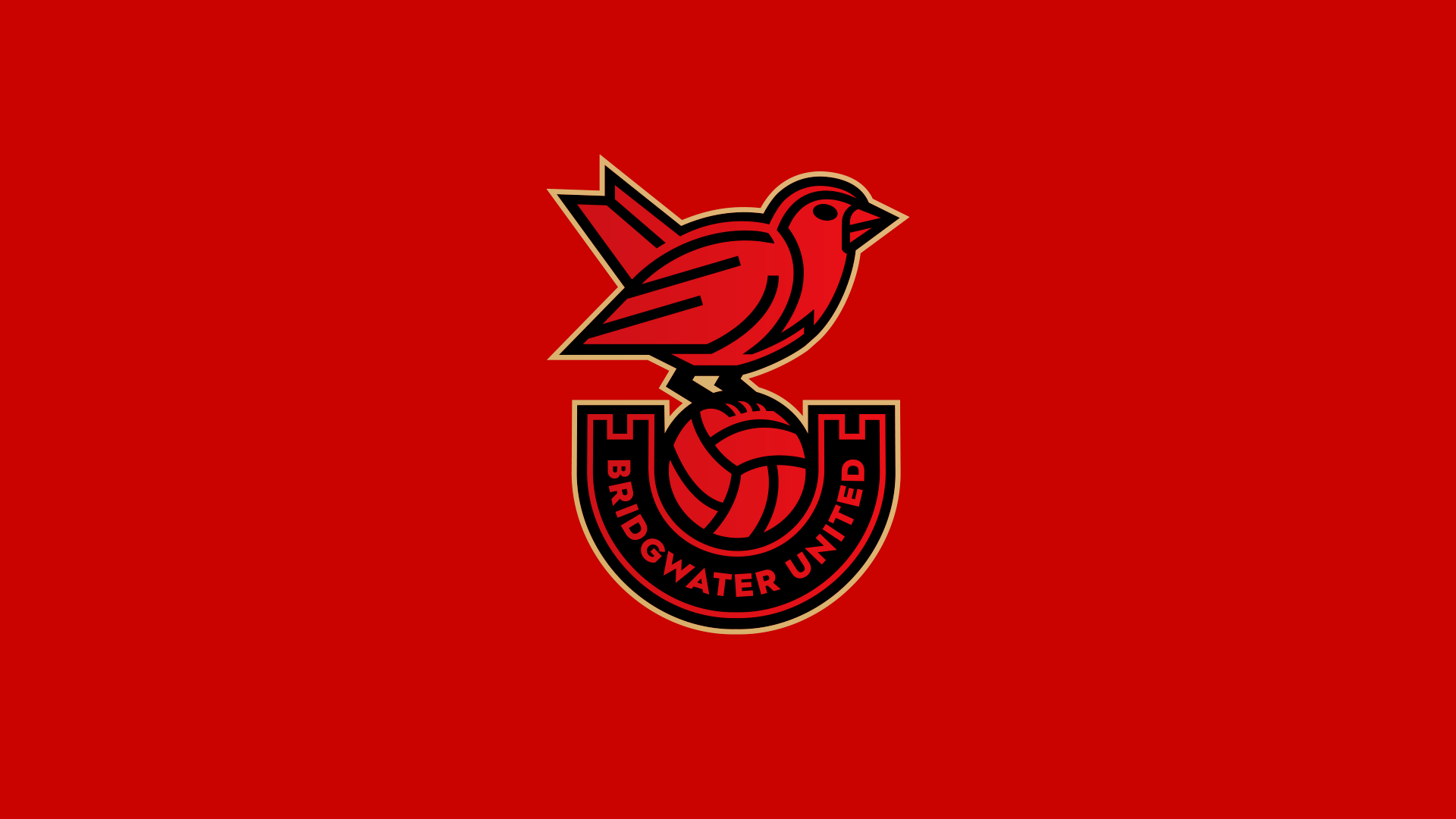
We recently shared the news that from the start of the 2021/22 season, Yeovil United and Bridgwater Town will be newly branded as Bridgwater United Football Club. As part of the launch of the club they have this morning shared their new club emblem and it’s a beaut.
The new crest will feature on all of the club’s kits, branding and communications and takes inspiration from the history of the town of Bridgwater. The United Robin centres around the club’s retained nickname with a dynamic classic leather football. The football is cradled in a U shape banner which adorns the club’s name and represents the United within our name whilst also featuring turrets that represent the Castle that once stood in the centre of the town.
The colours chosen provide a refreshed colour palette displaying a stronger, prominent crest that will provide both the club’s identity and a stronger visual impact in busy digital environments.
Giuseppe Fraschini, Director of Media and Communications commented on the launch by stating that “the brand evolution has been designed so that it is futureproofed and of our long-term strategic plan and our commitment to the town. With our fans and partners in mind our goal is to implement an exciting digital transformation to support the club’s growth via increased fan engagement. We also have the added ability to utilise a secondary brand alternative which will benefit the club going forward.
“The bold and contemporary visual style is the embodiment of the club’s vision to bring new life and aspirational change to Bridgwater and the surrounding area. We will do this via club and facility development of which further news is to be released combined with the ever-important community outreach and engagement through Bridgwater United Community Sports Trust.
Designer Chris Payne commented, “It was clear from the first conversation with Adam and Giuseppe, that this club has big plans for the future, and I am extremely proud to have played a small part in that big future. The design process was exciting, creative, and collaborative. There were many ideas and concepts put forward, but with the club’s nickname being ‘The Robins’ it felt right to place a Robin at the centre of the design and build further meaning around the Robin to visually tell a story that is unique to Bridgwater.
During the process, I met regularly with club directors and was constantly impressed by Adam and Giuseppe’s passion for the club, and openness to new ideas. I am very proud of the design that we are unveiling today, and I am excited about the brand that the club will showcase in the future. This is a huge step forward for the club and an important day in the club’s history”.
I love this design and it makes me excited to see what they come up with for the home and away strip. It would be nice to see if the away shirt incorporates the green and yellow of Yeovil’s history.


