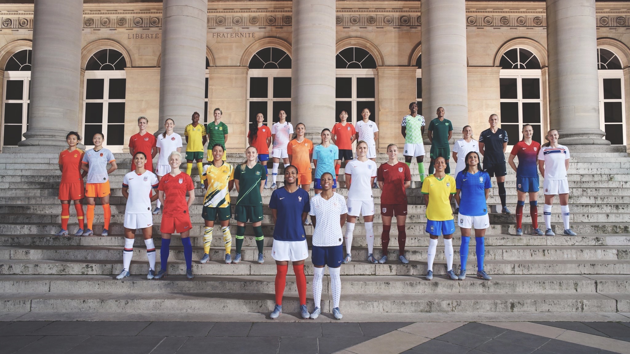
Ahead of the opening game of the FIFA Women’s World Cup 2019 on Friday, I take a look at some of the kits that will be on show over the next month.
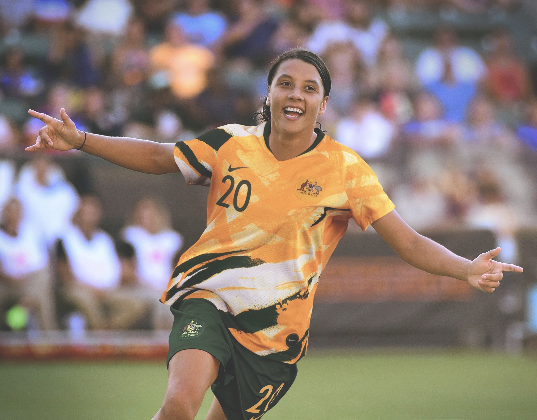
Australia: The Matildas give us two wonderful shirts; one easy on the eye, and the other..good but looking a lot like a wile art project. 7/10.
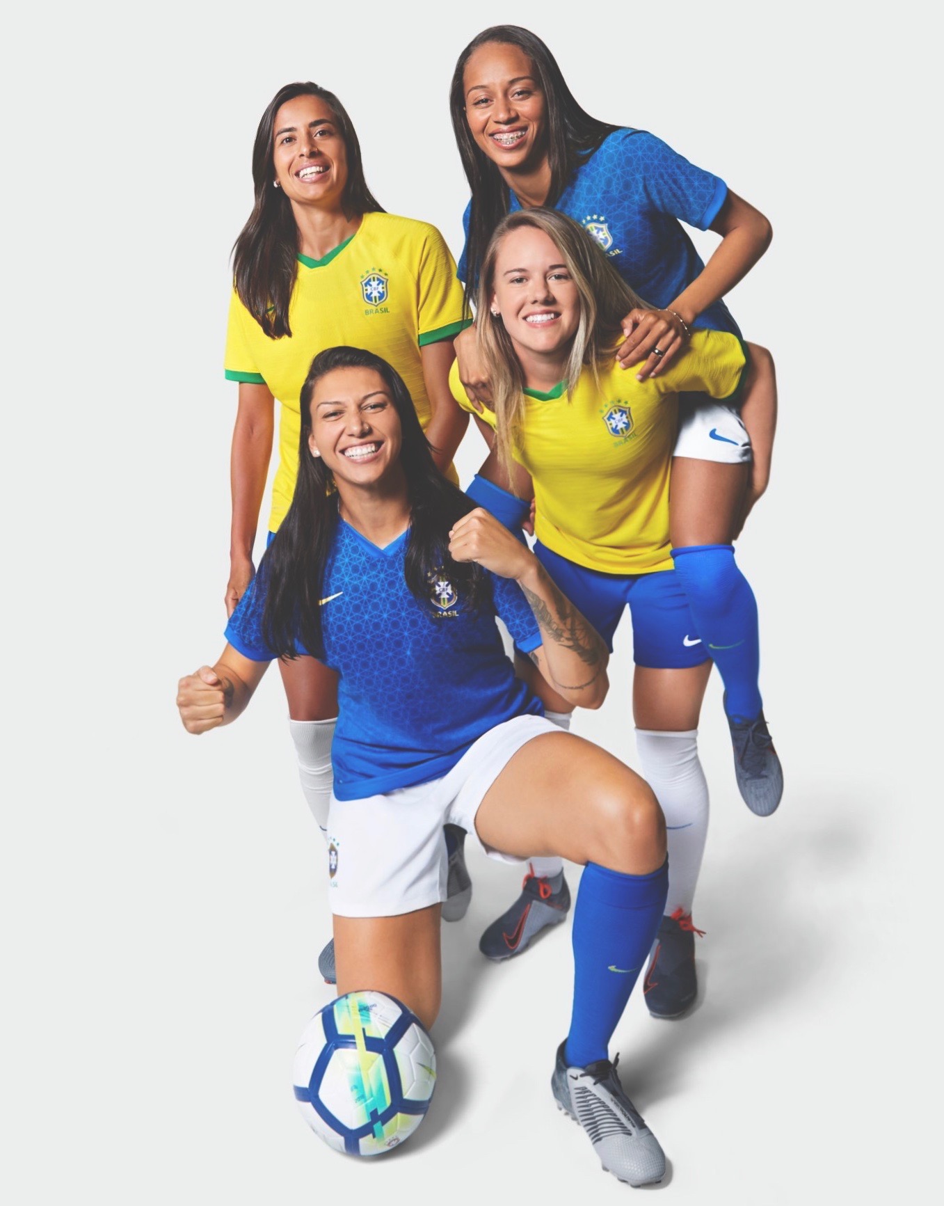
Brazil: Arguably a nation whose kit colours can limit creative ability, yet the home is similar to the 1970s and as for the blue, the circled-pattern works a charm. 7/10.
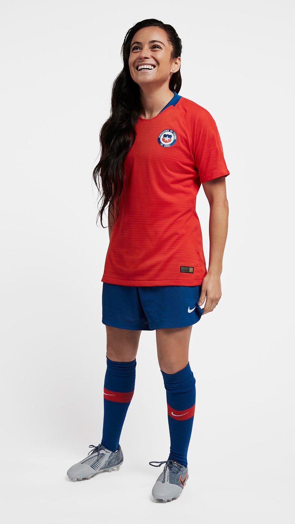
Chile: Both fit for the world stage. 6/10.
Canada: Nice, simple, and a Maple leaf. You know it’s Canada. 5/10.

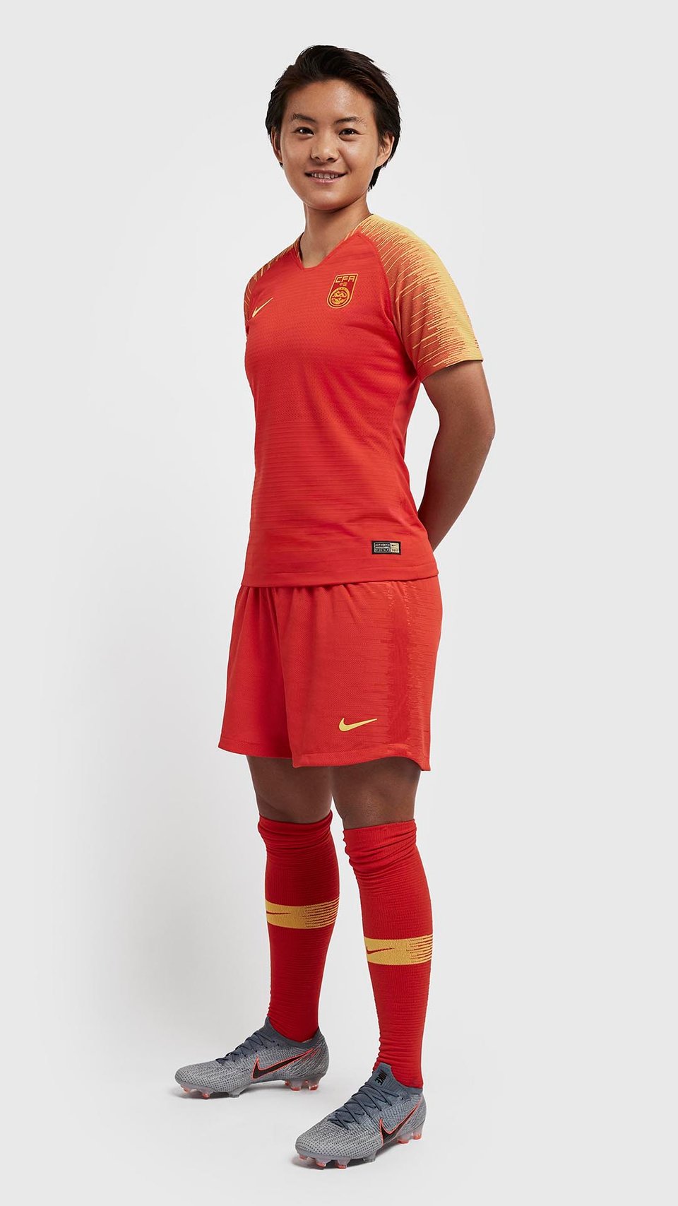
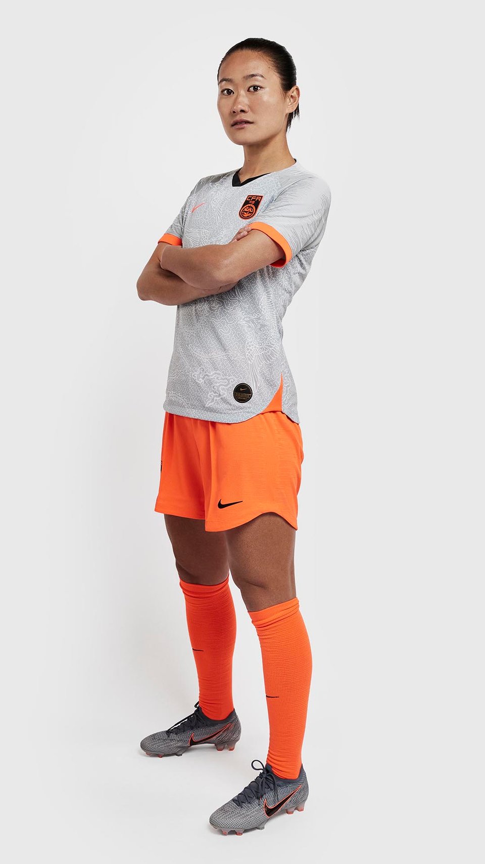
China: Really lovely work here from Nike, a smooth and easy on the eye dusty orange, with the waveform template on the sleeves. The away kit is arguably something the Dutch would have, but still a favourite from us. 7/10.
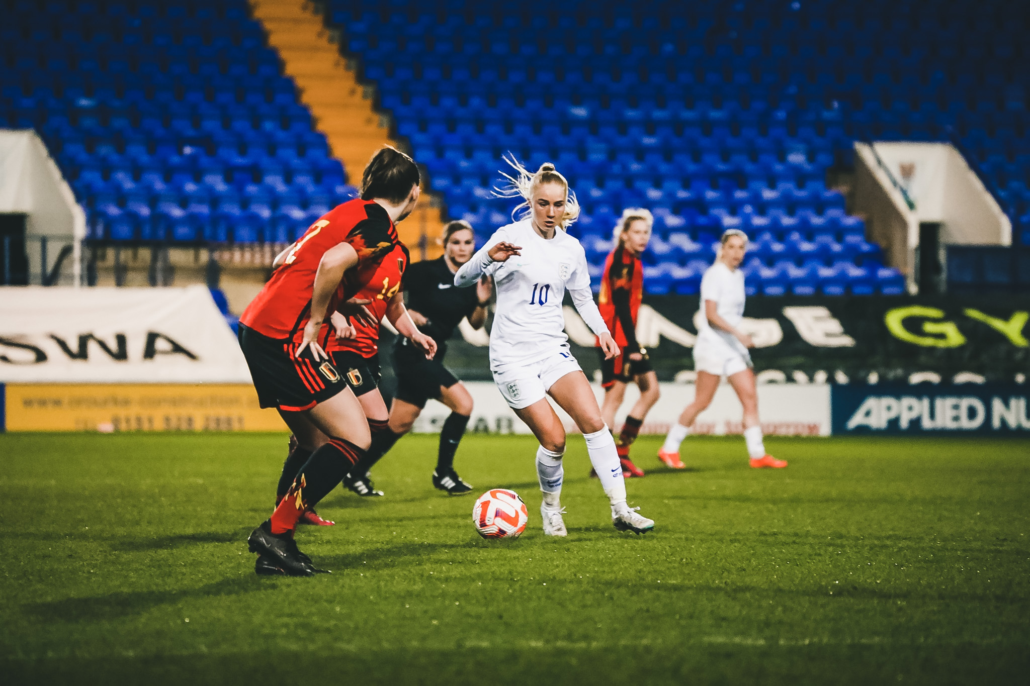
England: The Lionesses have also been given a kit designed solely for themselves, and it really is a lovely strip. Small defined lines across the middle, and swirling roses covering the socks, Nike have truly done well here on both. 8/10.

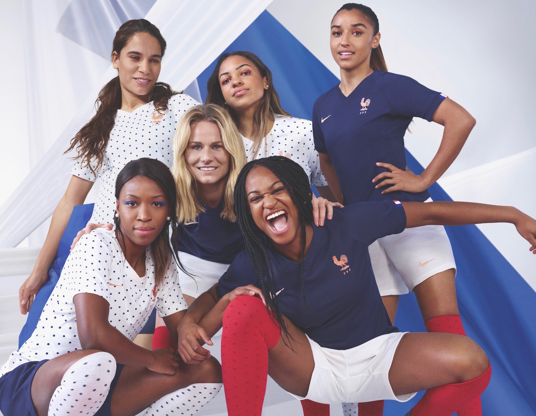
France: The hosts don’t offer too much in the way of design, but the tri-colour of the national flag is on show, along with a dotted Dalmation effort for the away. 7/10.
Germany: Perhaps best described as a ‘broken pattern’ version of the men’s national team’s current strip, but this effort from Germany is smooth. 7/10.

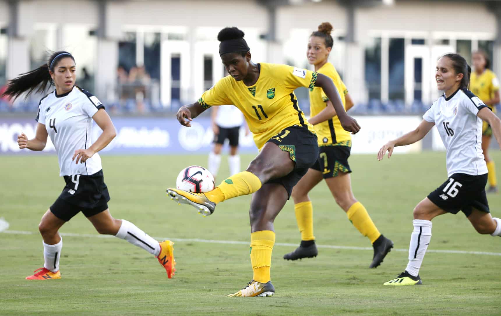
Jamaica: A lovely strip from the Caribbean side, with the Jamaican flag, patterned on the sleeves of the shirt and shorts. Smart effort – 7/10.
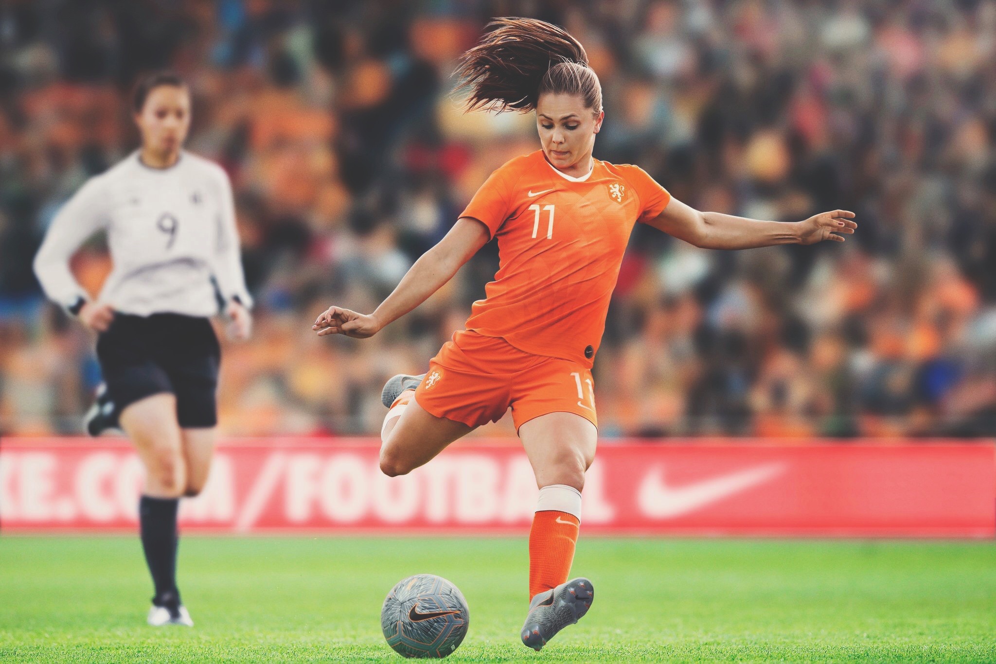
Netherlands: The Dutch have been provided with arguably one of the more prettier designs of the tournament, with decals from shirt to socks. 8/10.
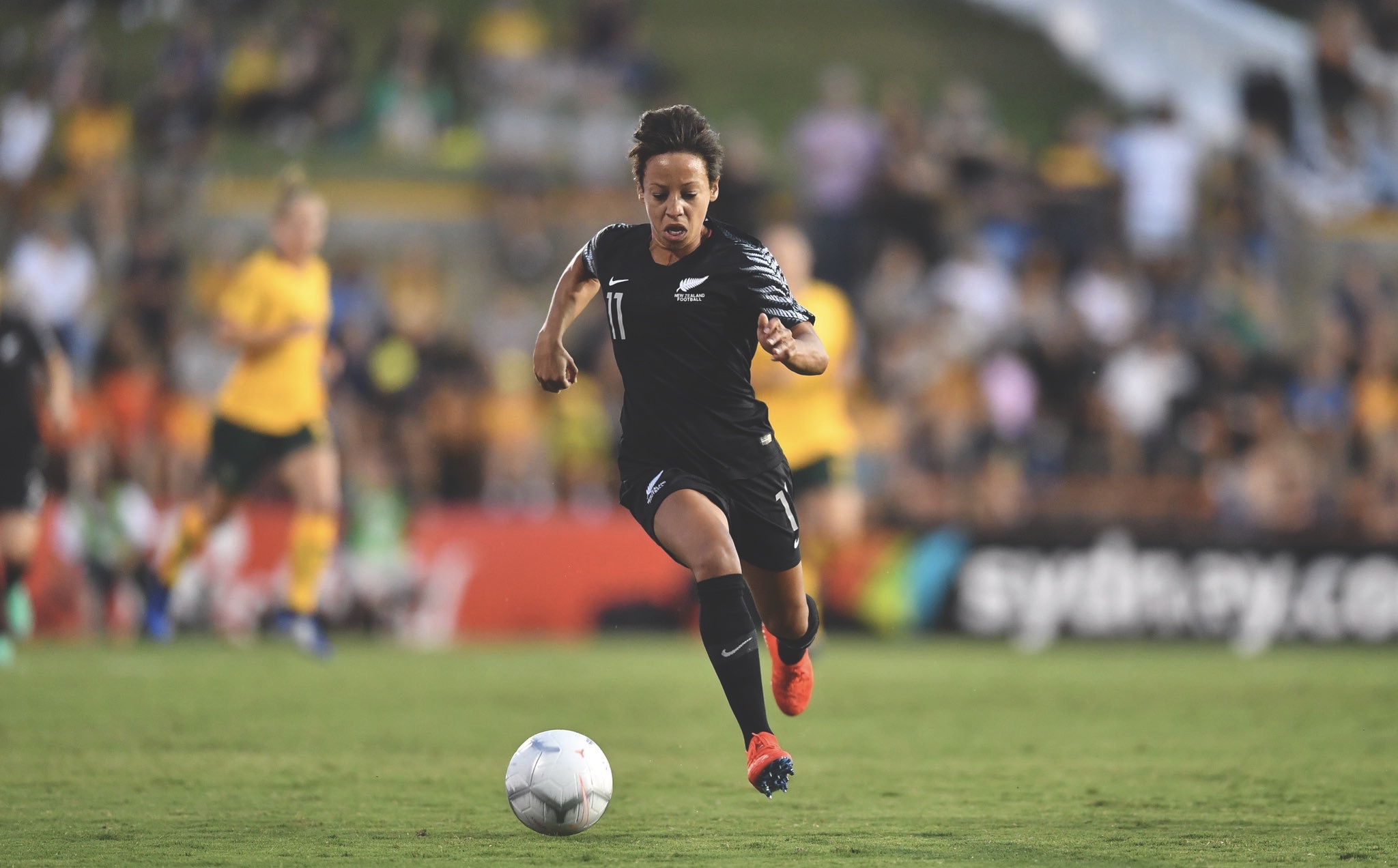
New Zealand: If you haven’t noticed by now, Nike does love regurgitating a template, and New Zealand gets nothing different. The home offers a classy all-white tough, with the feathers providing a nice fade down the sleeves, however the black second shirt, the white feathers provide a more striking element. 7/10.
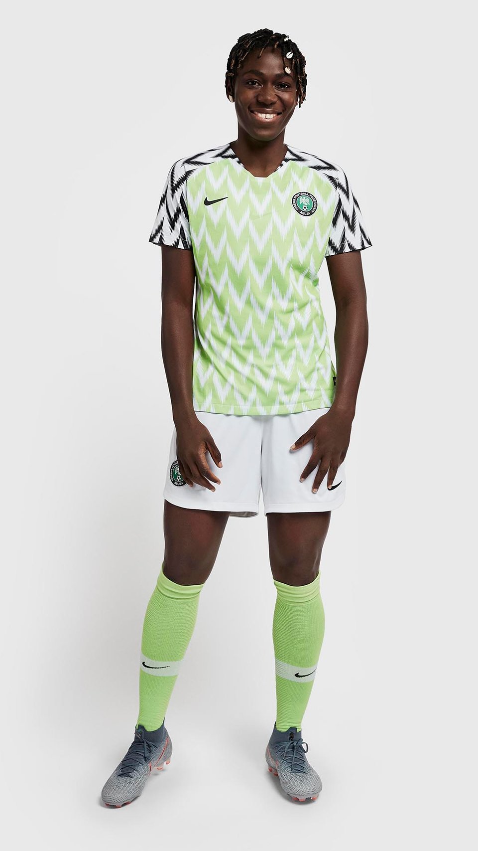
Nigeria: With the success of this beautifully striking shirt from the men’s World Cup in Russia, I cannot blame them sticking to what works. 8/10.
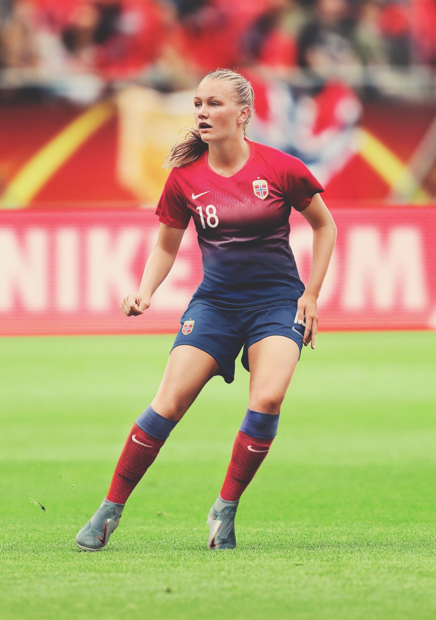
Norway: What a gorgeous kit this is! My personal favourite for the WWC. the striking red with the gentle fade down to the shorts, lush! As for the away, the lack of detail is bailed out by the home one, and that’s ok. 9/10.
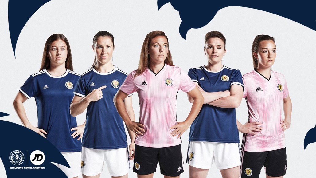
Scotland: England’s opening group game opponents Scotland have donned a near-identical kit to the men’s side, the only differences being a rounded collar on the home, and pink away compared to yellow. 7/10.
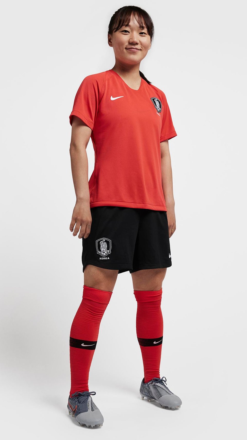
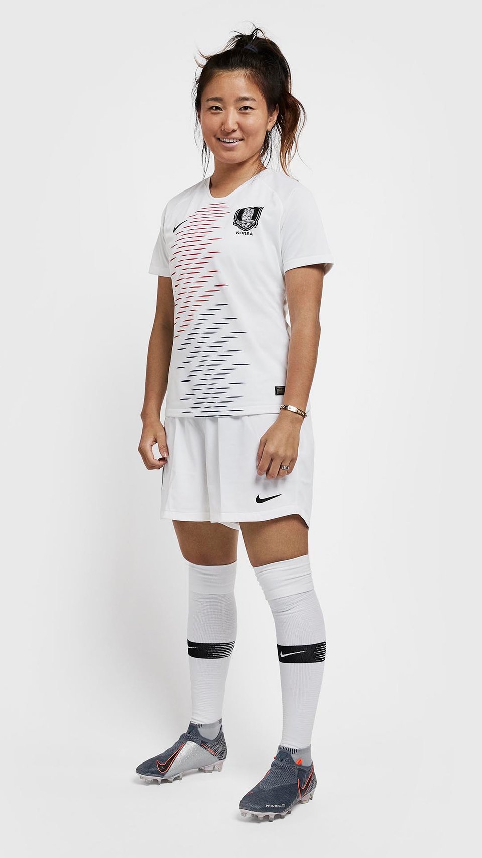
South Korea: Focus is on the white away kit here. The fade on the shirt in the shape of Korea is a marvellous little feature. 7/10.
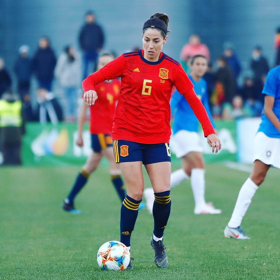
Spain: Classy, elegant and an all-round nice shirt. Will rank high. 8/10.
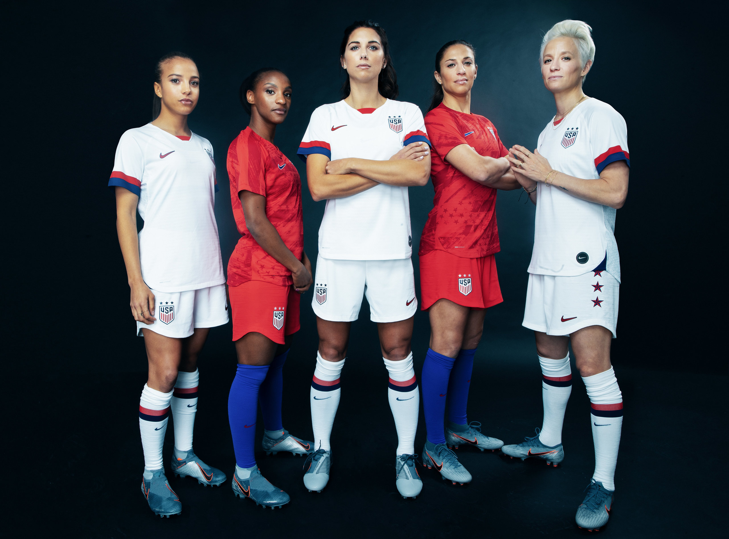
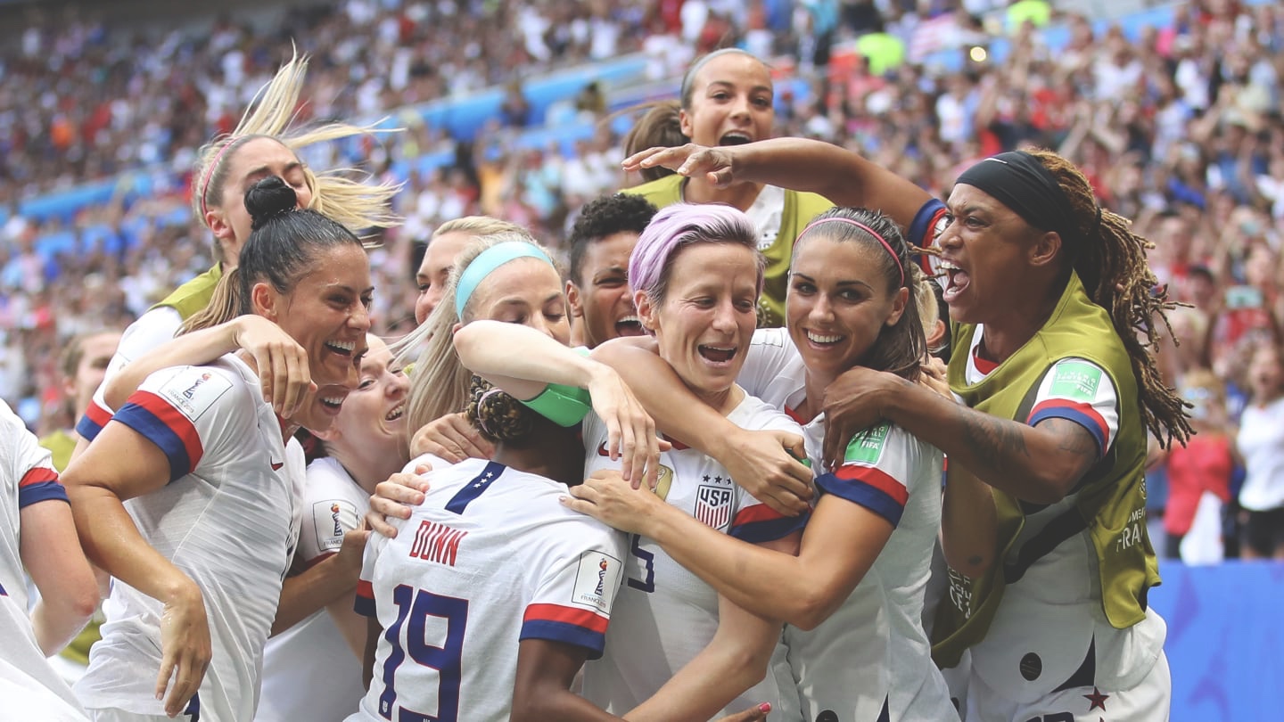
USA: Basic seems to be the theme among Nike for this tournament, as the Americans arrive in France with laid back designs, but endings to the sleeves, along with the stars down the sides of the shorts, add a little depth. 6/10.
