Since the hugely publised Nike World Cup kit launch where all fourteen kits were designed especially for the women’s teams, rather than as derivations of the kits made for their male counterparts. This detail and attention is found it’s way into the women’s club football also. It is great to see so many men’s teams welcoming their ladies to be part of the launch but there still isn’t quite enough but it is a step forward.
There have been some beautiful kits launched this summer and I wanted to share my top ten favourites.
Lyon (home)
If you’re widely considered to be the best club team in the world then you need a shirt befitting of that status and that is exactly what they have in this shirt. As ever the predominantly white shirt with silver stripes on the shoulders along with a red and blue finish on the sleeves to complete the tricolore. The level of details in this shirt is what sets it apart from many of the others on my list. The lower righthand side of the shirt features the embossed lion from Lyon’s logo and city crest.

Internazionale (away)
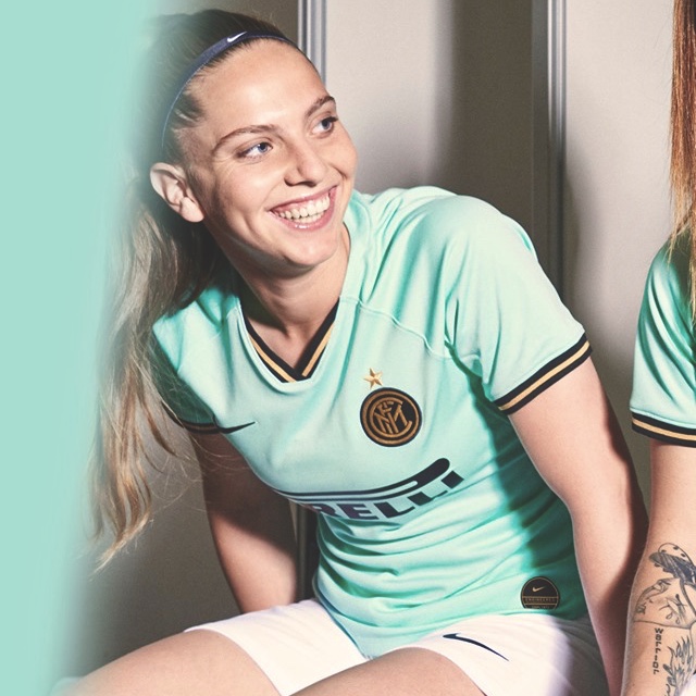
Potentially my favourite kit of the new season! Inter suffer with their home kit being striped, they and many other clubs in that position struggle to get very much diversity between their shirts. Unless like Juventus you want to switch it up completely. It is therefore left to the away kit to be the one that you can have a little fun with.
How lush is that aquamarine colour? I love how it is a colour that you rarely see on a kit but it doesn’t look garish. The historic Pirelli logo stands out on the shirt in black. It is a sponsor which has long become synonymous with Inter. In a nice little touch, the cross of St. George (a symbol of the city) is inserted inside the neck.
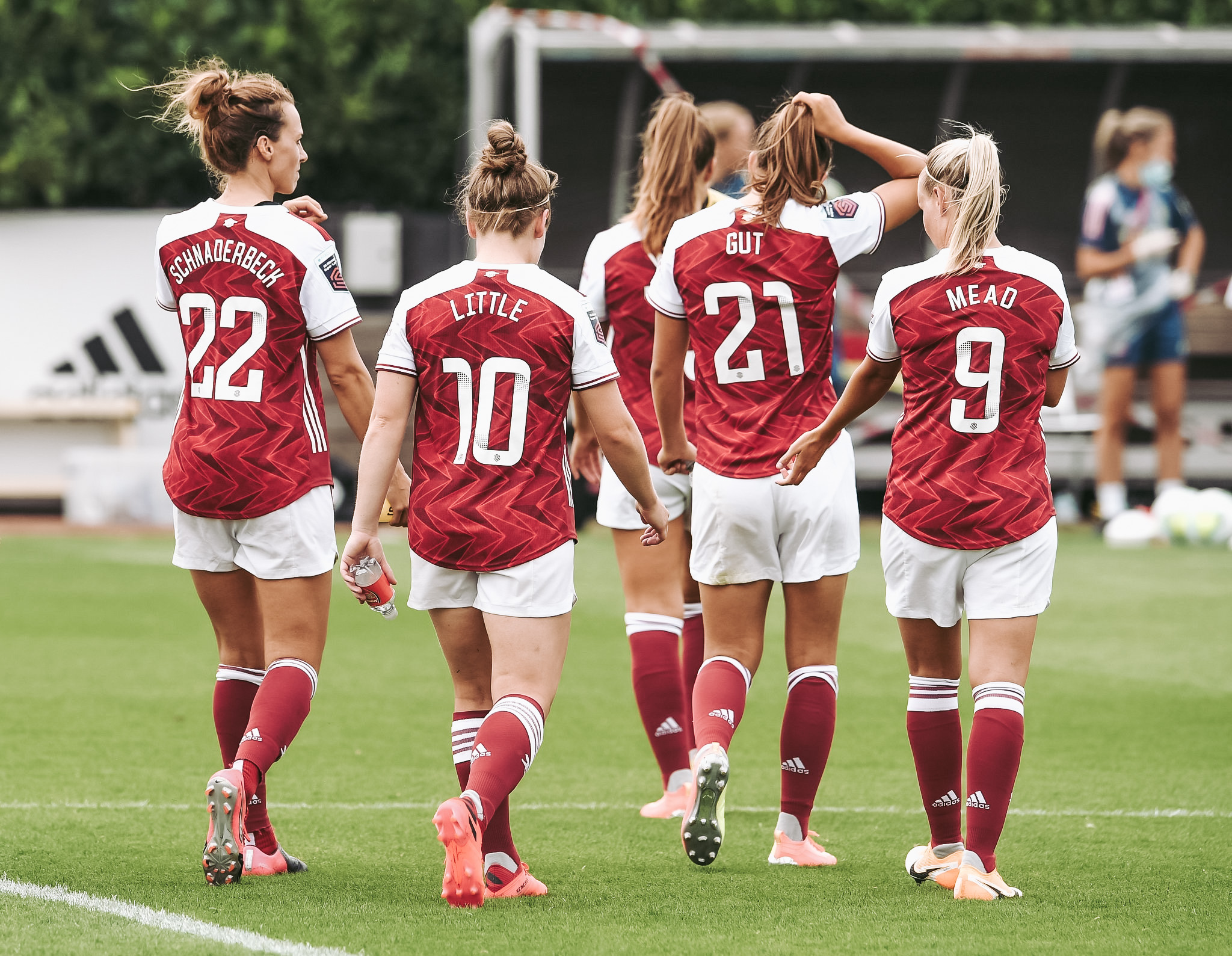
Arsenal (home)
The new kit for next season features a classic all-over red body, complimented by white sleeves and contrasting collar. The white high collar design is emblazoned with a central red stripe and black trimming. This design is repeated on both sleeves and the distinctive Adidas stripes run across the shoulder in a bright white.
The kit was launched alongside the film, ‘This is home’ which the clubs states that it aims to share a message about belonging. Arsenal.com says “The film shows how our players from around the world feel so at home at Arsenal and in London, they’ve become part of the fabric of the club and the community, adopting the accents of north London and real Arsenal fans.” Personally, I’d have liked to have seen more of the women in it, they feature for about five seconds of the two mintue film. This is very disappointing, especially as Arsenal have been the leading women’s side over the last few decades and that should definitely be celebrated more by the club.

Juventus (away)
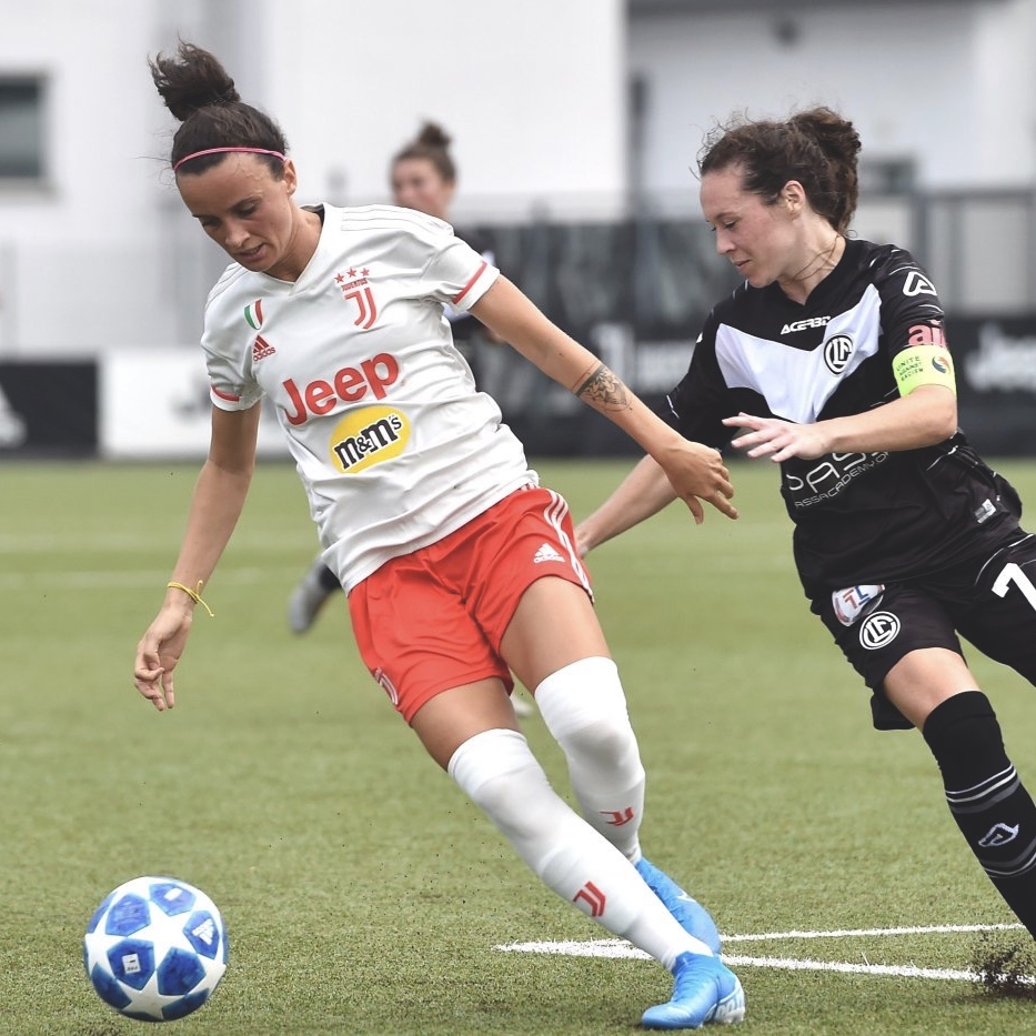
Juventus away shirt is predominantly white with a slight off-white trim and red logos. Upon closer inspection there is a subtle camouflage pattern on the body of the shirt. Based on a pretty Adidas template for the new season, the Juventus this shirt features a v-neck collar and red details on the sleeves.
After saying what I did about the difficulty in making your home shirt different when it’s striped, Juventus have opted for a half and half home shirt this season. The rumour for this is that in the American market the shirt looks too much like the American Football referee’s jerseys and they feel that this might sell more. Personally, I don’t like it but I’m always unlikely to buy a Juventus home shirt.
I’m not quite sure about the double chest sponsor though.
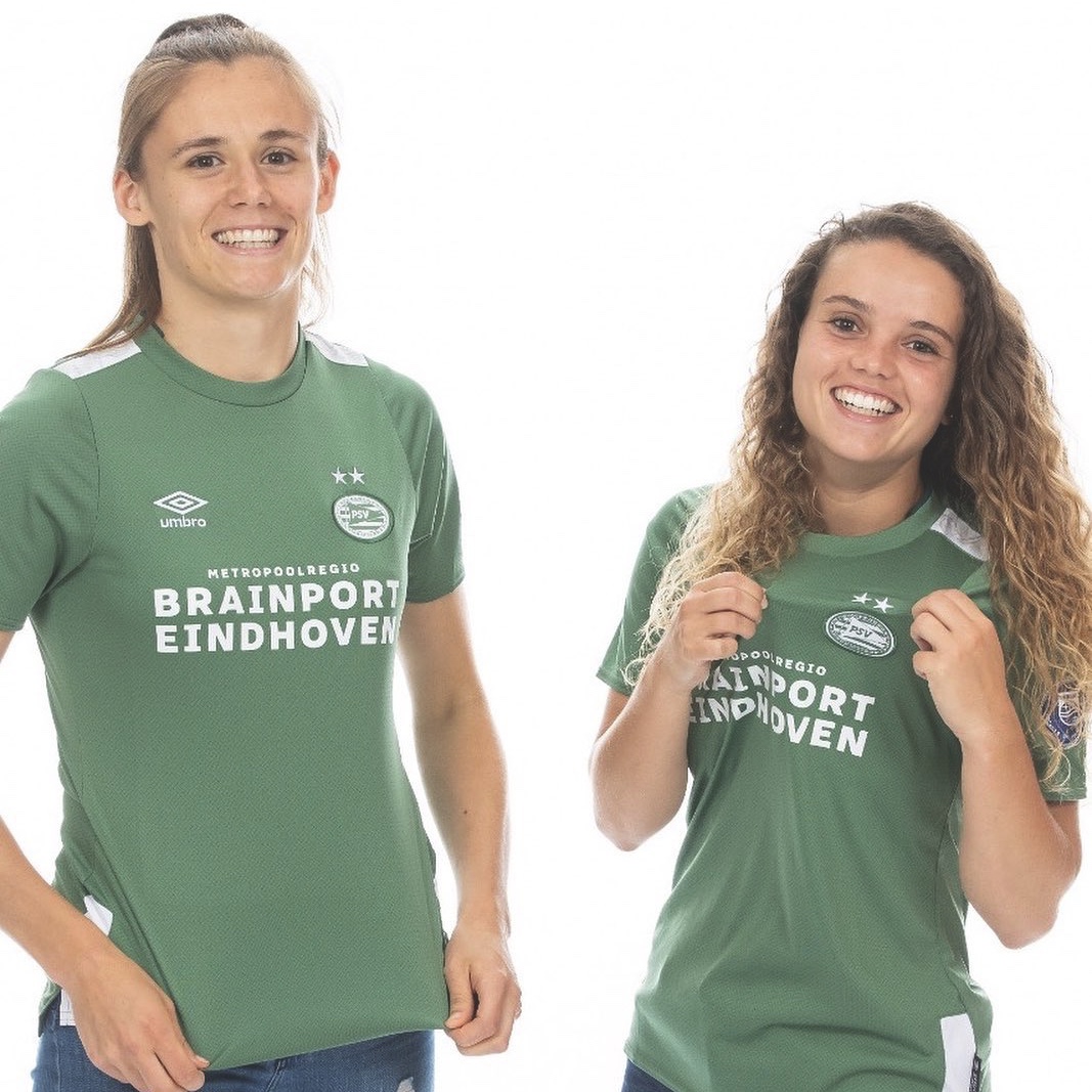
PSV (away)
The shirt itself doensn’t have much in a sense of design that stands out above other shirts although like Inter’s shirt, this features another rare colour you see on football shirts and that is probably why I like it. That and it’s similar to the colour that I’d like to paint my kitchen!
The official line is that this shirt is inspired by “street style,” what that means I have no idea. Umbro have also incorporated a reference to the very first stand on the sports field of the Philips Sport Vereniging in the shirt. This can be found on the white strip on the shoulder but unforunately cannot be seen in the photo (sorry).
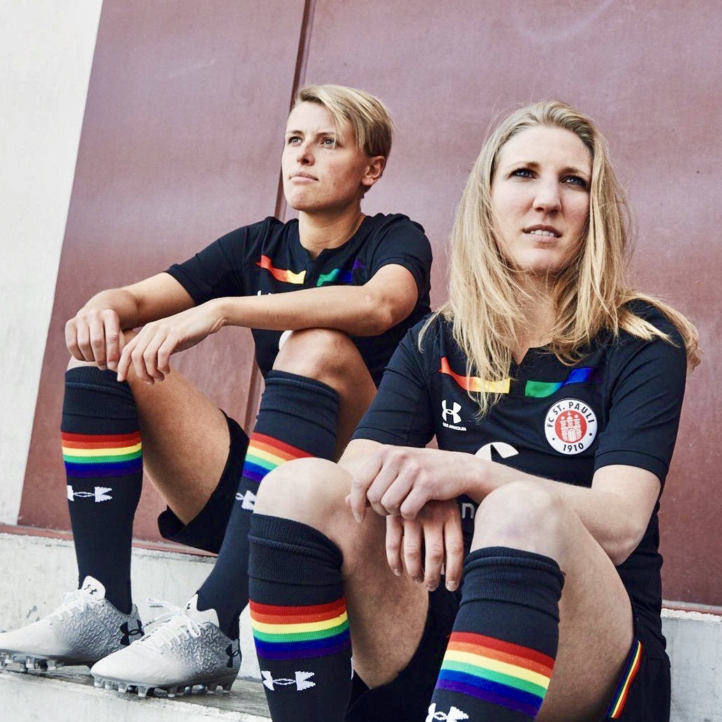
St. Pauli (away)
German side, St. Pauli, have a launched this awesome black kit with a rainbow-colored panel on the front just below the collar, as well as the trim on the shorts and socks. The biggest shame of this Under Armour kit is that being a third kit it won’t be worn in as many matches as it deserves to be.
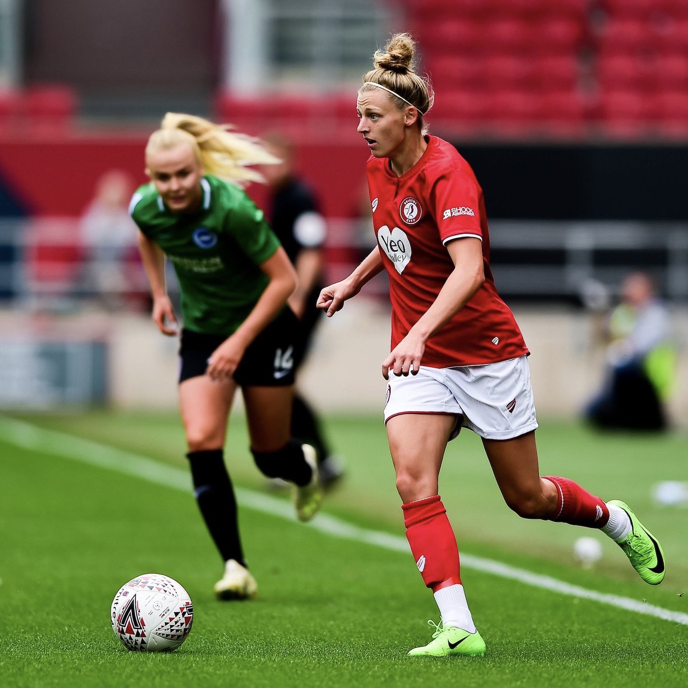
Bristol City (home)
There has been a bit of a re-branding for the Robins although our own resident Bristol City expert, Rich Paish, has assured me that despite the club’s best efforts they will still be known as the Vixens by the long standing support. I am a big fan of the new logo, it is simple, clean and very stylish, much like the new kit. I love the large Yeo Valley sponsor logo which is unique to the women’s side. They away shirt is also nice and is a carbon copy but black.
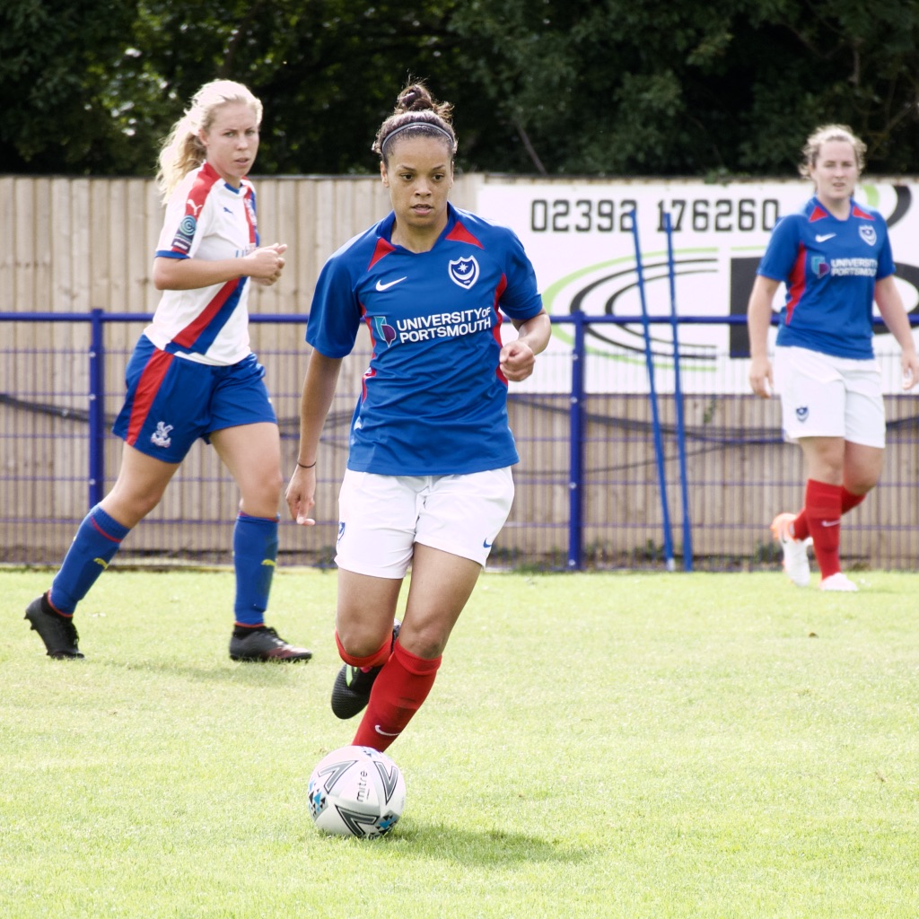
Portsmouth (home)
Pompey’s new shirt came out to mixed reviews intially because of the introduction of red on it but now we’ve seen it on the shelf and being worn by the team the fans seem to be happier. The red mesh underarm and shoulder insets offer added breathability, allowing airflow to the body. The shirt also features a hybrid v-neck collar, with a white taped seam at the back for a smooth feel. I am probably biased as I live in Portsmouth but I love the iconic blue shirts, white shorts and red socks combo.
Manchester United (home)
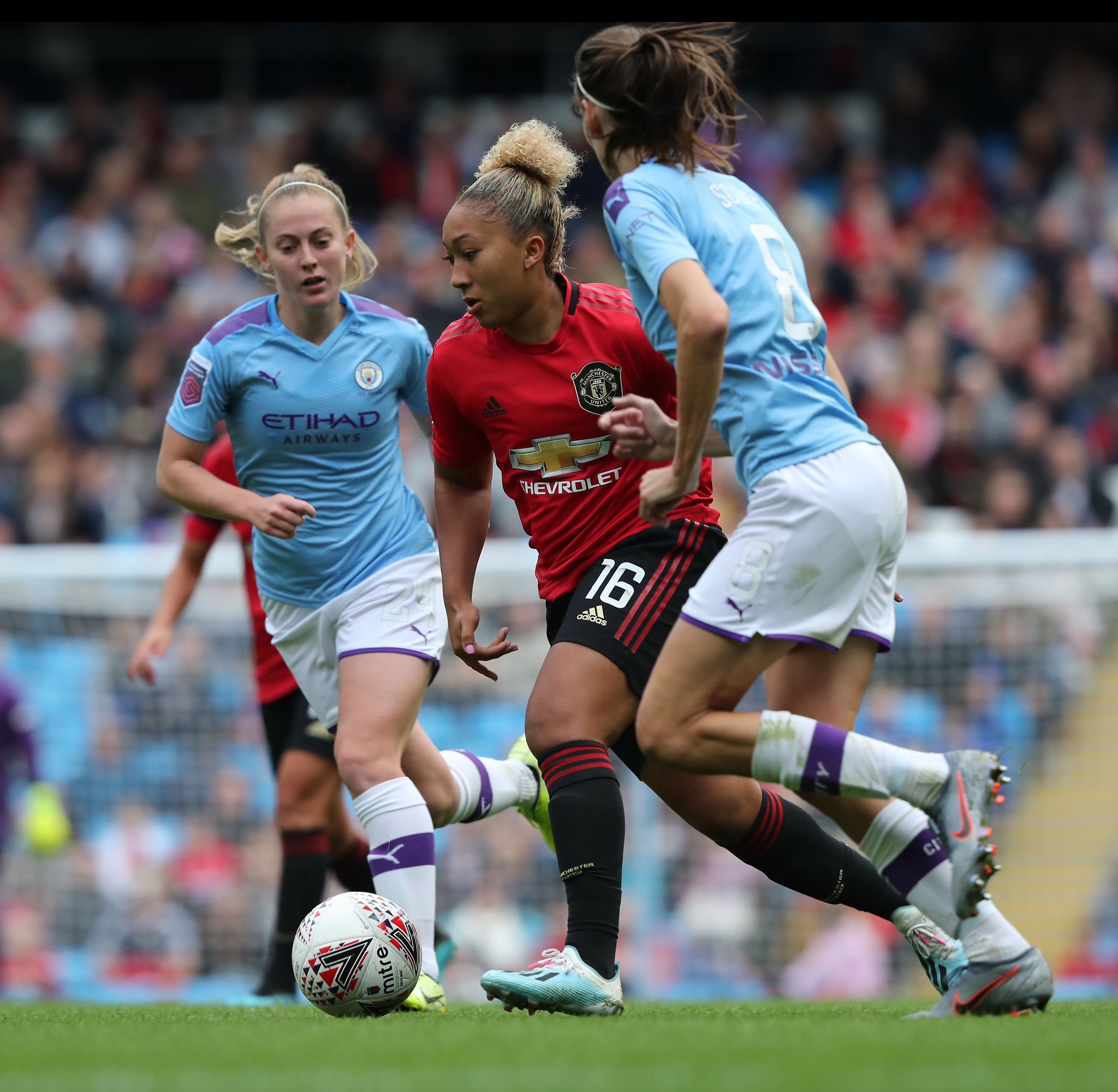
Being a fan of the Lyon kit then I am clearly going to be drawn to the new kit being worn by Casey Stoney‘s side due to the similar Adidas template. The nearly completely red shirt features a splash of black around the trim of the collar and the iconic stripes a different shade of red. The shirt features a commemorative crest, which takes inspiration from the shield seen on the chests of the men’s treble-winning heroes twenty years ago.
